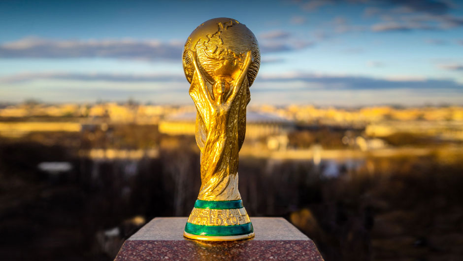
Over the past month, millions of fans around the world have followed the bouncing ball trajectory of their national teams. In tiny towns such as Chitré in Panama and Selfoss in Iceland—two countries that reached the competition for the first time—aficionados and aødáendurs have gasped and groaned as their teams stumbled on the Russian soccer turf.
UM Associate Professor Alberto Cairo, who holds the Knight Chair in Visual Journalism, has closely tracked World Cup action—though not for wins or losses or goals scored, but instead to identify and visualize data trends related to the games. Though admittedly not a fútbol fan, Cairo is a specialist in data visualization for storytelling and, in addition to his academic responsibilities, has worked as a consultant for Google, Microsoft and Netflix, among others.
Three years ago he was approached by Google News Initiative (GNI), formerly Google News Lab, to serve as an artistic director and coordinate multiple teams of top designers around the world to spin out spiffy graphs and charts to visually “tell” the story of a range of data-driven topics, such as how people “search for food,” “for the Mexican elections,” and “how to fix things.”
With FIFA World Cup Russia 2018 looming large on the horizon, Cairo and the “how-people-search-for-the-World-Cup” team set to work.
“It’s been quite a learning experience to talk on a biweekly basis with some of the most talented visualization designers around the world,” Cairo said, adding that he plans to invite some of the designers to his classes at UM this fall as guest lecturers “to expose the students to their incredible creativity.”
Originally from Spain, Cairo earned his M.A. and Ph.D. in Information Society Studies at the Open University of Catalonia in Barcelona, Spain. He launched his career in journalism at El Mundo, a major Spanish daily newspaper. While there, he began to create animated visual explanations and pictorial visualizations and led the formation of the paper’s Infographics Department.
Cairo joined the School of Communication in 2012. In addition to the Knight Chair, he is the author of several books, including The Truthful Art: Data, Charts and Maps for Communication and The Functional Art, the director of the Visualization Program at the Center for Computational Science, and teaches courses on graphics and visualization.
The World Cup project is focused on providing data on the many levels on which people search for data. What teams are most searched for? How did search interest trend in Malaysia? Senegal? Argentina? How did it change during a specific match? A massive amount of data is culled at many levels from national to regional and even at the neighborhood level—all in real time.
Google provides the data, and designers create new, innovative ways to represent it. As the artistic director and project manager, Cairo’s role has been to provide guidance and art direction to ensure an attractive publishable format for the projects.
GNI, which launched in March 2018, seeks to enable journalism to thrive in the digital age by elevating “quality news”—and by so doing to counter the proliferation of “fake news.” Through projects such as this one for the World Cup, GNI strives to help respected media expand their ad revenue by providing free, digital, open-source content.
As part of the partnership, the design teams have created tools for anyone to design graphics for free, among them Flourish.
The World Cup project has been pretty straight forward. “Polygraph knew what they wanted to do; they used bread-and-butter graphics which made it quite easy,” Cairo said.
While the cup gets its last kicks on Sunday with France and Croatia squaring off in the final, Cairo’s participation in the project will continue to reap benefits for the University. In addition to inviting designers to his classes this fall, some students will have the opportunity to create their own projects through GNI to utilize data storytelling.
Additionally, Cairo will be coordinating the data storytelling Tapestry Conference, which convenes visualization designers from the around the world, at UM from November 29-December 1, and in early 2019, a Center for Computational Science conference also at the University.

