While tropical cyclone activity will undoubtedly decline with the end of the 2022 Atlantic hurricane season on Nov. 30, University of Miami researchers from across the institution will continue the important work of analyzing storm data throughout the year in the hopes that their efforts will help improve forecasting and modeling.
Since 2018, they have included a new element in their research portfolio: studying the appearance of and information conveyed in the National Hurricane Center’s (NHC) Tropical Cyclone Track Forecast Cone, the visual graphic that communicates the most likely path of the center or eye of a tropical cyclone.
Television meteorologists use the cone extensively during their hurricane forecasts, and thousands of people access the visual via social media, making it the NHC’s most popular graphic.
“It’s become the go-to communication tool for tropical cyclone weather events, and people want to see it,” said Scotney Evans, an associate professor in the School of Education and Human Development. “But unfortunately, it’s widely misinterpreted.”
Evans is part of a team of researchers that recently completed a University of Miami Laboratory for Integrative Knowledge (U-LINK) study that examined why so many people incorrectly interpret the graphic—colloquially called the “cone of uncertainty”—and worked with the NHC and the National Weather Service (NWS) in exploring ways to improve certain aspects of the graphic.
For their study, they surveyed more than 2,800 Florida residents on their understanding of the cone, finding that many of the respondents had difficulty interpreting several aspects of the graphic such as the size of a storm, areas of likely damage, watches and warnings, and wind intensity categories.
“We found that for some of the questions we posed, up to 40 percent of the respondents were misinterpreting what the cone graphic says and what the cone graphic does not say,” said Sharan Majumdar, a professor of atmospheric sciences at the Rosenstiel School of Marine, Atmospheric, and Earth Science, who was one of six investigators involved in the study.
Introduced in 2002, the cone is based on historical track errors over the past five years, according to Brian McNoldy, a tropical cyclone expert at the Rosenstiel School and one of the study authors. “It generally gets smaller each year just because track forecasts have improved considerably,” he said.
Where many people err in their interpretation of the cone is where storm impacts will be experienced, McNoldy said. Of the 2,847 residents surveyed in the U-LINK study, almost half mistakenly presumed that regions outside the cone were out of harm’s way, while 40 percent believed the cone indicated where storm damage would occur.
“The cone has always meant the same thing; it’s a two-thirds likelihood of where the center of the storm will track,” McNoldy explained. “Being that it’s a two-thirds likelihood for the center of the track, there’s still a one-third chance that the center of the storm could be outside of the cone. But even for a track that ends up being right down the center, what’s important to remember is that hurricanes are large, so even if a storm is tracking right down the middle of the cone, the impacts from it will extend far outside of the cone.”
Complementing their survey, the team also held focus groups with Miami-area residents. Those in-person meetings revealed some of the same misinterpretations of the cone reported in the survey of Floridians such as the size of the storm and impact areas.
Conducted at various locations around Miami-Dade County, the focus groups also revealed other misinterpretations. Some people, for example, believe they would be safer if they were located just outside the track cone while others incorrectly assume there is no risk at all beyond the limits of the cone, according to Barbara Millet, director of the University of Miami User Experience Lab and assistant professor of interactive media at the School of Communication.
“We also learned in those focus group that some people think the cone graphic is overloaded with many different types of information,” said Millet, who conducted many of the sessions. “The graphic provides not only the projected track line, but also the cone depicting forecast uncertainty, areas under hurricane and tropical storm watch and warning, sustained wind speeds, and a map legend. But all that information and the way it’s presented can contribute to clutter and information overload, thus hindering comprehension.”
The survey results, which were published in the Bulletin of the American Meteorological Society in October, suggest a “rethink” on how to communicate certain attributes of the cone more effectively. “Graphical communication strategies need to be revised to better support the different ways in which people understand forecast products, and these strategies should be tested for validity in real-world settings,” according to the study.
And that is why the researchers, through a new National Oceanic and Atmospheric Administration grant, are continuing to collaborate with NHC and NWS stakeholders on studying potential ways to develop graphics that are more directly actionable than the cone.
“What we’re now investigating is more impact-related graphics,” Majumdar said. “We’ve been evaluating existing graphics in design charettes and in experiments with Miami-area residents, and we’re using their feedback to think about how to create more effective redesigns of these impact graphics,” he added. “We’re hoping that these graphics will be better able to convey what the potential is for impacts from a storm and that storms are very large systems that can cause damage hundreds of miles away from the center. We need to be better at conveying to the public the risks of a significant impact.”
Millet and the team created two alternate versions of the NHC’s track cone, tweaking the colors used to communicate hurricane watches and warnings and changing other aspects of the cone’s appearance. Those design modifications were presented to a test group, yet most people still had trouble interpreting the cone graphic correctly, Millet noted.
She said that there is room for improvement in the way the current cone is presented. “The cone graphic constrains the information that can be communicated about tropical cyclone forecast information; and on its own, may not convey the information the public needs to make decisions about protective actions. Forecast products that include information about all the hazards may be more relevant to the public,” she pointed out.
Information tailored to a specific region might be helpful, noted Evans. “One of the things that came out of the focus groups and out of the later design charettes was that people want more localized information. The current cone basically shows you a map of Florida or even the whole Southeast. It doesn’t really tell you what’s going to happen to you in your neighborhood or in your part of Miami. That was something that we documented as being a need and a want. That’s not really captured by the current cone in any way. The localized information piece was important.”
Kenny Broad, a professor of environmental science and policy at the Rosenstiel School, and Alberto Cairo, associate professor and Knight Chair in Visual Journalism in the School of Communication’s Department of Journalism and Media Management, also participated in the study.
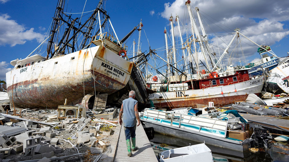
Their work has taken on greater urgency after criticism from residents that the cone did not accurately forecast the landfall of Hurricane Ian, which devastated Florida’s southwest coast on Sept. 28. McNoldy points out, however, that the landfall location of the storm’s center ultimately stayed within or on the edge of the cone throughout the forecast cycle.
Doing away with the cone is not an option.
“It’s tempting to want to engineer a quick fix to the cone, but we need to be scientifically disciplined and wait for the body of evidence to come forward and then determine how to best apply it,” Jamie Rhome, acting director of the National Hurricane Center, said in a Q&A posted on the center’s website shortly after Ian walloped Southwest Florida.
“We aren’t planning an immediate pivot away from the cone, and I don’t think the cone is ever going to go completely away,” he wrote. “It still has merit for conveying high-level information about where the center of the tropical cyclone is likely to move, especially for storms where the entire track is over water.”