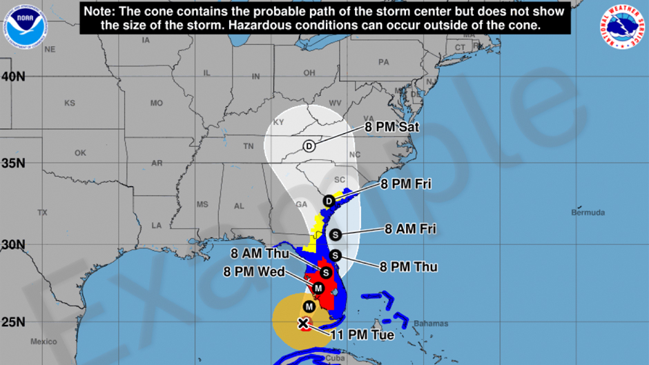
It is arguably the National Hurricane Center’s (NHC) most iconic graphic: the Tropical Cyclone Track Forecast Cone, which communicates the most likely path of the center, or eye, of a cyclonic storm.
Ever since it was introduced more than 20 years ago, the graphic has been misinterpreted by many people, with some incorrectly believing that areas outside the cone are safe from storm threats.
Now, nearly two years after a University of Miami study revealed that a redesign of the graphic might help clear up some of the confusion that surrounds it, the hurricane center will roll out an experimental version of the forecast cone aimed at better conveying the hazards people face from landfalling tropical storms and hurricanes.
While the modified version of the graphic, which the NHC will start using for the 2024 hurricane season in both the Atlantic and Eastern Pacific basins, will still feature the familiar forecast cone, it will now layer color-coded tropical storm and hurricane warnings alongside it.
The graphic has undergone a handful of iterations since it was first introduced on July 14, 2002 for tropical storm Arthur, the latest version being adopted in 2017 to include the size of the wind field at the time of an advisory.
“Right from the start, the primary criticism of the cone was that it gave people the wrong impression that it indicated threat—if you’re inside of the cone you’re in trouble, and if you’re outside of it, you’re fine. But that is not at all what it is designed to indicate and is a dangerous misinterpretation,” said Brian McNoldy, senior research associate and tropical cyclone expert at the Rosenstiel School of Marine, Atmospheric, and Earth Science.
“In this version, the change is reducing the visibility of the track forecast cone if it’s over land where wind-related watches and warnings are present,” McNoldy explained. “The appearance doesn’t change at all when it’s over water, which is the majority of most storms’ lifetimes. Importantly, in this year’s experimental graphic, hurricane and tropical storm watches and warnings are displayed on the map, including inland areas. The cone graphic has always included those watches and warnings, but they were only displayed along coastlines. Expanding those inland reflects the reality that a hurricane does not vanish at the coastline.”
The debate surrounding the cone reached its height in late September 2022, when powerful Hurricane Ian zeroed in on Florida, eventually making landfall as a Category 4 storm near Cayo Costa in Lee County and going on to batter the other barrier islands of that county. Many residents said Ian’s track caught them off guard. But in reality, the landfall location of Ian’s center ultimately stayed within or on the edge of the cone throughout the forecast cycle.
“The center line of the track forecast wobbled around as it often does,” McNoldy pointed out. “But the cone containing the most likely trajectory perfectly did its job and always contained the eventual landfall point.”
McNoldy is part of a team of researchers that conducted a U-LINK (University of Miami Laboratory for Integrative Knowledge) study that examined why so many people incorrectly interpret the NHC’s cone graphic.
For their study, they surveyed more than 2,800 Florida residents on their understanding of the cone, finding that many of the respondents misinterpreted various aspects of the graphic—some, for example, believing they would be safer if they were located just outside the track cone while others assumed there was no risk at all beyond the limits of the cone.
“The residents surveyed for our U-LINK study were interested in having a graphic that helped them know what to do and when,” the team of researchers said in a statement. “The new experimental graphic developed at the National Hurricane Center takes an excellent step in this direction by emphasizing the tropical storm and hurricane warnings both at the coastline and inland. It provides a more direct route towards understanding the potential impacts than the old graphic.”
The U-LINK research project is one of several studies over the past 17 years that have identified difficulties in interpreting the cone graphic. “While our study may not have directly influenced the redesign of the NHC cone, it provided supporting evidence that a redesign would be useful,” the U-LINK researchers said.
With funding from the National Oceanic and Atmospheric Administration’s (NOAA) Social Science Program, the team is continuing its research, developing experimental graphics to better communicate potential threats from wind, flooding rain, and storm surge.
“We have been conducting a series of experiments and participatory design activities with the public, as well as conducting interviews with broadcast meteorologists and emergency managers to test these graphics,” said Barbara Millet, director of the University of Miami User Experience Lab and assistant professor of interactive media at the School of Communication. “The feedback received from these research activities, along with the input from our NOAA collaborators, is being utilized to refine and improve the experimental graphics.”
The Rosenstiel School’s Sharan Majumdar, a professor of atmospheric sciences, and Kenny Broad, a professor of environmental science and policy; Scotney Evans, an associate professor and chair of the Department of Educational and Psychological Studies in the School of Education and Human Development; and Alberto Cairo, associate professor and Knight Chair in Visual Journalism in the School of Communication’s Department of Journalism and Media Management, also participated in the study.
While the track forecast cone has been called all sorts of names, most notably the “cone of uncertainty,” those names are not the official title, “and therein lies part of the communication and interpretation challenge,” NHC deputy director Jamie Rhome said back in October 2022. “These unofficial titles might convey a message which doesn’t always align with the intended application of the track forecast cone.”
As to how effective the hurricane center’s revamped cone graphic will be once it is unveiled remains to be seen, according to McNoldy. “It’s tricky, as the answer will depend on what type of storms we get hit with in 2024,” he said. “People react very differently to weaker storms compared to stronger storms, and stronger storms are going to take more advantage of the inland extent of watches and warnings. But it is a positive change in my opinion, since it clearly shows that hurricane hazards extend far from the center of the storm, far inland, and most importantly, outside of the cone.”